Fruitful Design
Full-screen, single-product focus — each fruit gets its own world.
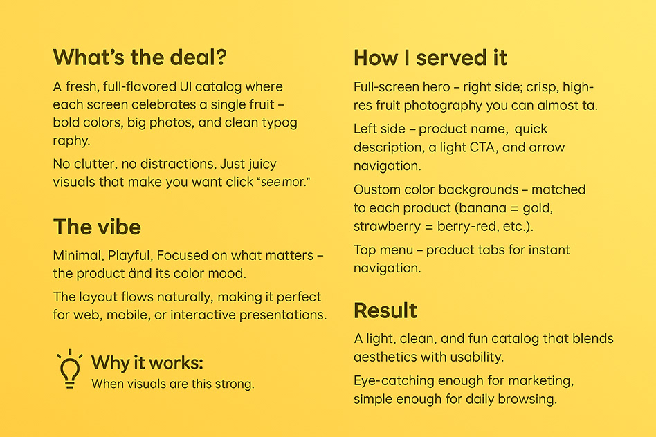
One product, one world, one screen
Fruitful Design is a UI concept for a premium fruit product catalog app. The core idea is radical simplicity: each screen is dedicated entirely to a single fruit, with bold photography, full-bleed color environments, and a minimal typographic layout that lets the product speak for itself.
Rather than a traditional grid-based catalog, the app uses full-screen vertical scrolling through individual product worlds — each with its own custom color palette, background treatment, and typographic mood, all tied together by a consistent structural system and navigation pattern.
Each fruit, its own palette
Unity through diversity
Creating a unified design system while allowing each product screen to feel unique and on-brand presents a genuine tension in UI design. A system too rigid produces screens that feel generic; a system too loose loses coherence across the catalog. The challenge was to define exactly which elements must remain constant — navigation pattern, typography scale, interaction model, add-to-cart layout — and which elements must be free to vary completely per product: color environment, background treatment, typographic weight and tone, accent palette.
Four phases from concept to catalog
Concept & Art Direction
Defined the core visual idea: one product per screen, full-bleed color, minimal text. Studied reference points from luxury food photography, editorial design, and premium e-commerce apps. Established the emotional register — bold, sensory, confident — that would guide all subsequent design decisions.
System Architecture
Designed the fixed skeleton of every screen: status bar zone, product number indicator, full-bleed product area, name and origin label, price display, and CTA button. Defined spacing tokens and a typographic scale that would remain constant across all fruit screens, providing structural coherence beneath the visual variety.
Per-Fruit Visual Design
For each of the six fruits, developed a dedicated visual world: background color derived from the fruit's secondary tone, a hand-crafted SVG illustration of the fruit, a custom accent color for the CTA, and selected supporting micro-details. Each fruit was treated as an individual branding exercise within the shared system.
Transition & Interaction Design
Prototyped swipe-based navigation between product screens in Figma, with a full-screen color transition that fades through a neutral midpoint before settling on the next product's palette. Designed micro-interactions for the add-to-cart button, product zoom, and a floating navigation indicator showing position in the catalog.
What makes each screen feel complete
Per-Product Color Palettes
Each fruit has a curated 4-color palette: background, primary illustration tone, highlight, and accent. Colors are derived from the fruit itself but pushed toward richer, more saturated values for screen vibrancy.
Full-Screen Product Focus
No grid, no sidebar, no clutter. Each product occupies the entire visible canvas, with the fruit illustration scaled to dominate roughly 55% of screen height — creating an immediate, sensory impression before any text is read.
Custom SVG Illustrations
Rather than photography placeholders, each fruit was illustrated in Illustrator as a custom SVG with layered transparency, highlight passes, and characteristic anatomical details — seeds for pomegranate, leaf crown for mango, cluster formation for berries.
Minimal Typography
Strictly limited to four text elements per screen: product number, category tag, product name, and price. No descriptions, no ingredient lists on the main screen — these appear only on a secondary detail drawer to keep the primary experience uncluttered.
Swipe Navigation
Vertical swipe moves through the catalog. The transition uses a shared-element animation: the color background expands or contracts to fill the screen before the next product's illustration fades in, maintaining visual flow without a hard cut.
Consistent Structural Grid
Despite the visual variety, every screen shares identical margin values, CTA button dimensions, text positioning, and navigation indicator placement — ensuring the app feels like a single product, not a collection of one-offs.