Dreambook
A mobile app for dream interpretation. Discover the meaning of your dreams through an intuitive interface and a rich database of dream symbols.
Helping users understand the
language of dreams
Dreambook is a comprehensive mobile application that helps users interpret their dreams. The project was created in response to a growing interest in lucid dreaming and the need for an easily accessible tool for dream symbolism analysis.
Problem
Existing online dream dictionaries are visually outdated, hard to navigate, and offer no personalization. Users have to wade through ads and illegible content to find the interpretation of their dream.
Solution
We created an elegant mobile app with a dark theme, intuitive search, a category and favorites system, and the ability to customize appearance and text size.
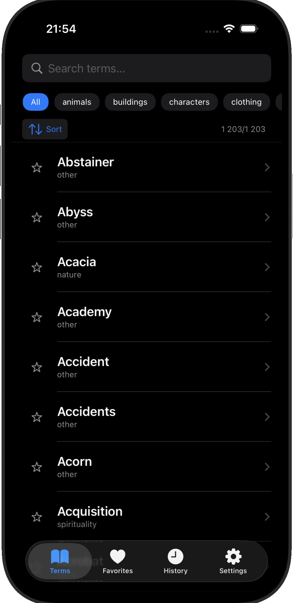
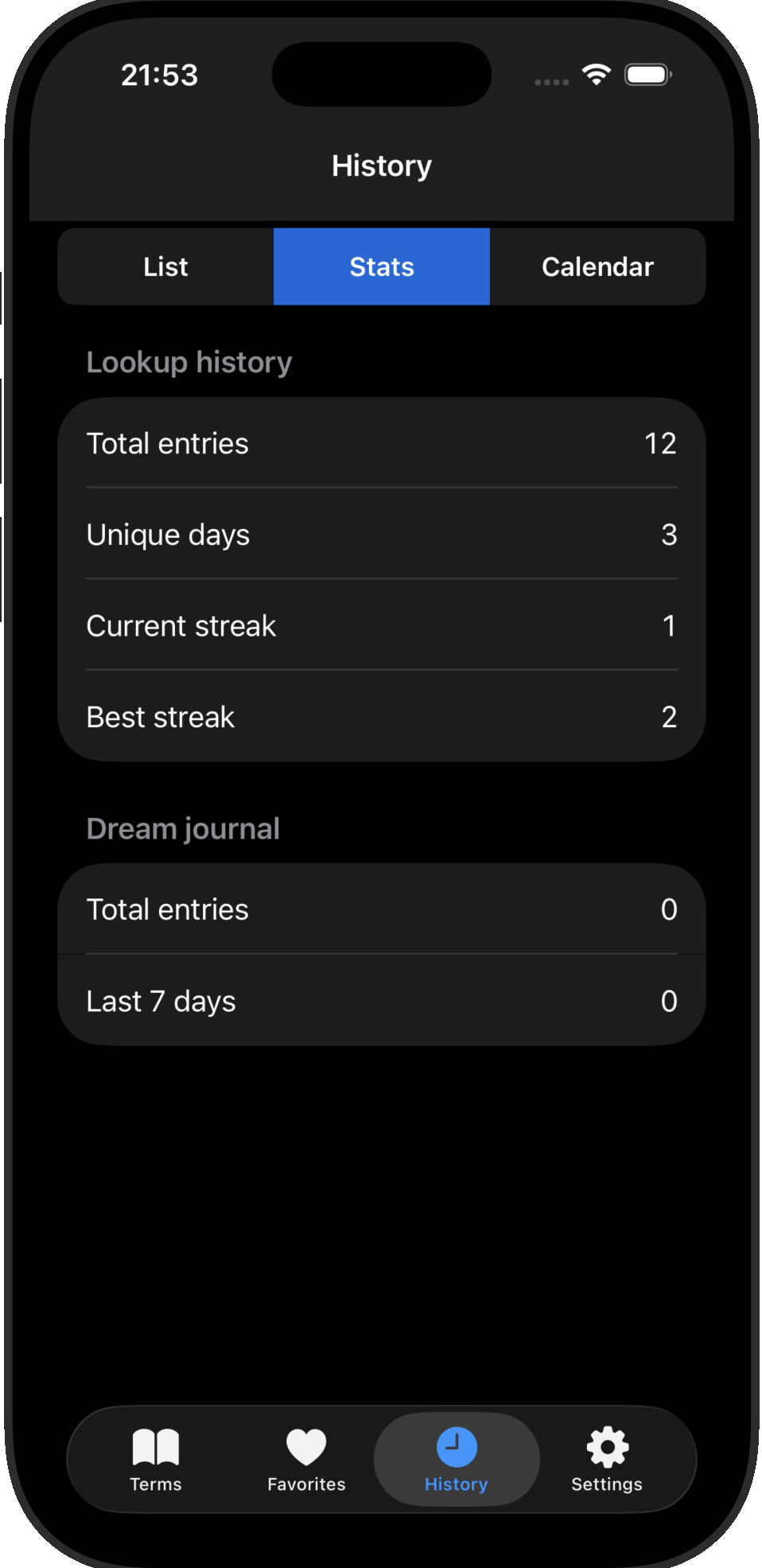
Search
Fast filtering across 1,203 entries with auto-suggest functionality
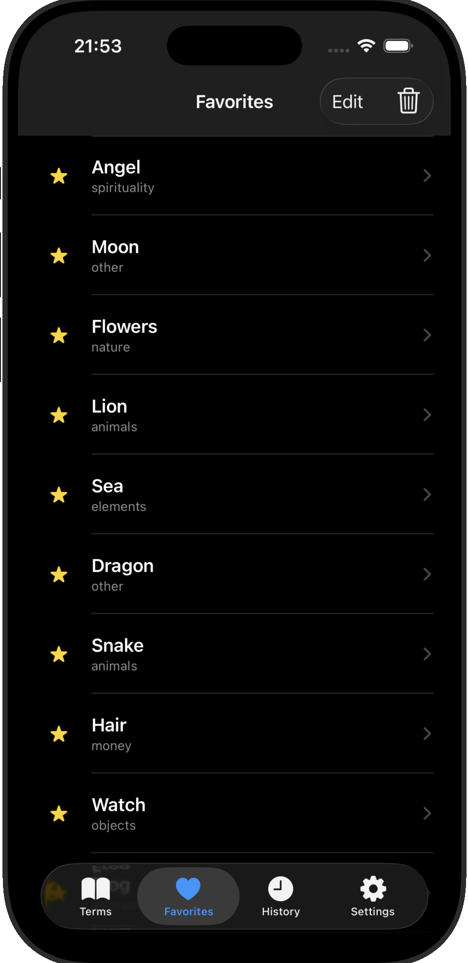
Favorites
Save the most important interpretations for quick and easy access
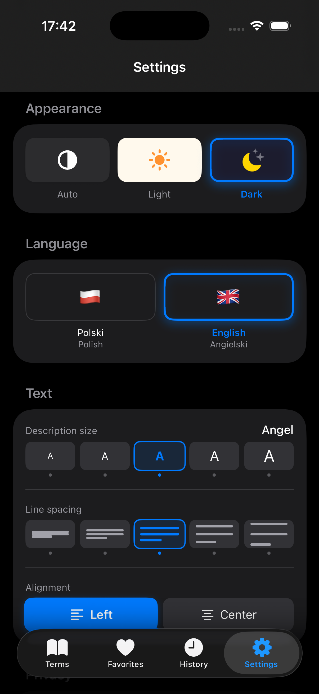
Dark Theme
Comfortable nighttime usage with auto, light, and dark mode options
Customization
Adjust text size, line height, and alignment for optimal readability
From idea to finished product
A solo project from start to finish. I handled every stage — from competitive analysis and concept through UI design in Figma to native development in Swift.

I analyzed existing dream dictionaries and apps on the market. Most were cluttered with ads, visually outdated, and offered poor search. I identified an opportunity for a clean, dark-themed, native iOS app focused on readability and speed.
I structured over 1,203 dream entries into thematic categories with a tagging system. I designed the navigation flow prioritizing quick search access — the most common user need identified during competitive analysis.
I designed the full interface in Figma — dark theme optimized for nighttime use, with a focus on typography customization and comfortable reading. Created a component-based design system to ensure consistency across all screens.
I built the app natively in Swift using Xcode. The architecture uses SwiftUI for the interface layer with local data persistence. The development phase spanned from July 2025 to March 2026.
I tested the app extensively on multiple iOS devices, refining animations, transitions, and edge cases. The app includes accessibility features like adjustable text size, line spacing, and alignment options.
Every detail matters
Designed for nighttime use
The dark interface minimizes eye strain during nighttime usage. Every screen has been optimized for easy one-handed operation.
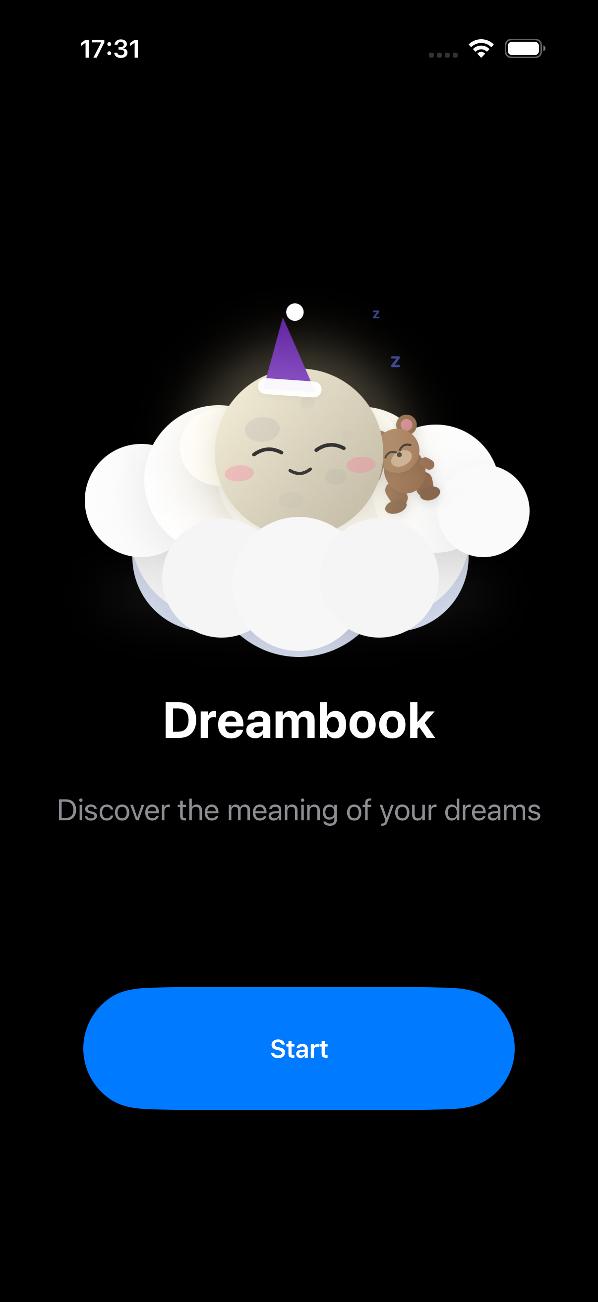
Splash Screen
An eye-catching splash screen featuring a moon and bear mascot. Builds an emotional connection with the user from the very first touch.
A cohesive visual system
A dedicated design system based on a dark color palette and clean typography, ensuring visual consistency across every screen.
Color Palette
Typography
UI Components
Measurable outcomes
The app was met with enthusiastic user reception, exceeding initial business goals.
"The best dream dictionary I've ever had on my phone. The dark theme is perfect for nighttime use."
"Simple, fast, and ad-free. Exactly what I was looking for."
"Great text customization options. Everything is readable and comfortable."