Color Analyzer
Instant WCAG 2.1 contrast analysis and full color values — without ever leaving Figma.
Built to close the accessibility gap in Figma
Color Analyzer was built out of a real daily frustration: checking WCAG contrast during design review meant switching between Figma and browser-based tools, manually entering hex values, and cross-referencing AA versus AAA thresholds. The process was slow, error-prone, and interrupted the design flow.
The plugin ecosystem had tools for contrast checking, but most were limited — checking only one surface at a time, omitting CMYK values needed for print handoff, or lacking clear AA/AAA distinction. Color Analyzer was built to be the single tool that answers every color question a design system team might need.
Accessibility checks shouldn't break your flow
Designers working within WCAG-compliant systems need to verify contrast ratios constantly — for text on backgrounds, icons on surfaces, UI components against dark and light themes simultaneously. The manual workflow required copy-pasting hex codes into external tools, running two separate checks for AA and AAA, converting between color spaces for developer handoff, and repeating this for every color decision. Color Analyzer solves all of this in a single click, directly inside Figma, with no context switching required.
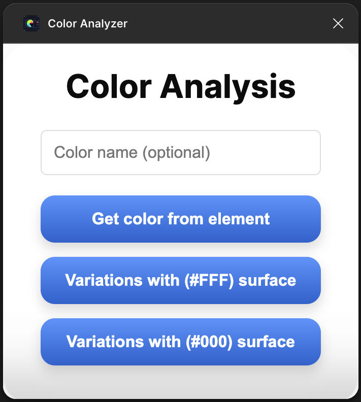
Everything you need in one panel
Dual-surface WCAG check
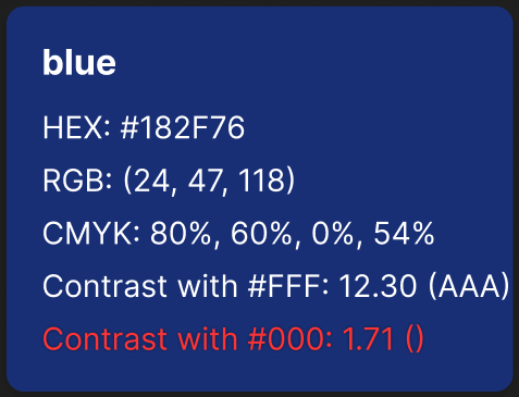
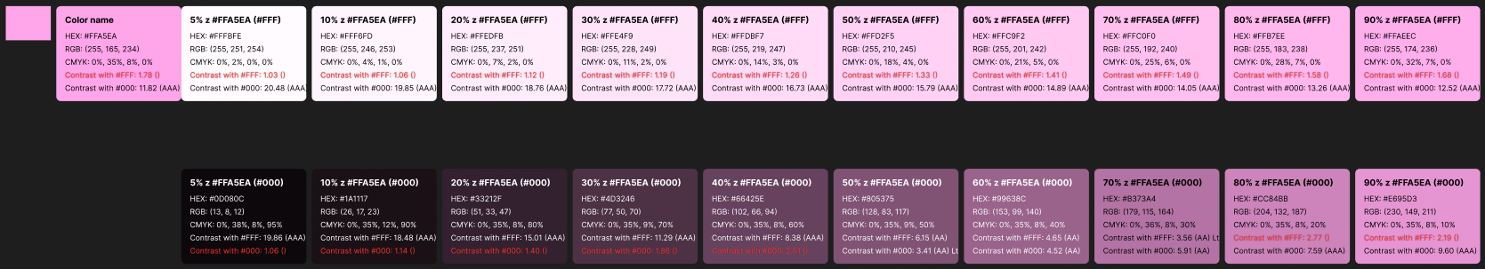
Evaluates WCAG 2.1 AA and AAA contrast ratios against both #ffffff and #000000 simultaneously — one click shows exactly where your color passes or fails across both light and dark contexts.
Full color space output
Retrieves HEX, RGB, and CMYK values for any selected color in a single view — no format switching, no manual conversion. Covers both screen and print handoff needs in one place.
Clear pass/fail result card
Results are displayed as a clean card with numeric contrast ratio values and color-coded pass/fail indicators for each compliance level — instantly readable at a glance during design review.
Works on any Figma color
Compatible with fills, strokes, and applied color styles — whether from the local file or a shared library. Just select a layer and run the plugin, no manual input required.
See it in action
From spec to shipped plugin
Research & Specification
Audited the existing Figma plugin ecosystem to identify gaps: which tools existed, what they covered, and where they fell short. Reviewed the WCAG 2.1 specification to define exact pass thresholds for AA and AAA. Mapped all color space conversions needed — HEX to RGB to CMYK — to establish the mathematical foundation of the plugin.
Plugin Architecture
Designed the plugin's data flow: reading the selected node's fill via the Figma API, extracting RGBA values, converting to the required color spaces, computing relative luminance per WCAG formula, and calculating contrast ratios against both surfaces. Separated the computation layer cleanly from the UI layer to allow future extensibility.
UI Design & Testing
Designed the plugin UI to prioritize instant readability: color swatch at top, tabular color values below, and a two-column WCAG result panel with numeric ratios and clear pass/fail badges. Tested across a wide range of colors — edge cases, near-threshold values, semi-transparent fills — and iterated on badge design to eliminate ambiguity between AA and AAA at small sizes.